
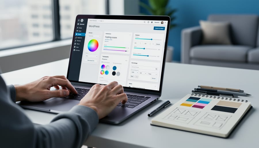
You can align your website with your brand identity in a matter of hours by customizing your existing theme’s colors, typography, logo placement, and core visual elements. This approach preserves your site structure, content, and functionality while transforming how visitors perceive your business. The process requires no coding expertise if you’re working with a modern WordPress theme or contemporary website builder, though understanding a few CSS basics opens additional possibilities.
Most businesses waste thousands of dollars and weeks of productive time on complete site rebuilds when strategic theme customization delivers the same brand alignment at a fraction of the cost. Your current platform likely includes built-in customization tools that let you adjust primary and accent colors, upload custom fonts, modify header layouts, and control spacing throughout your design. These changes ripple across every page, creating visual consistency without touching individual templates or rebuilding content.
The key is working methodically through your brand’s visual hierarchy. Start with the elements visitors notice first: your logo, navigation menu, and hero section. Then move to typography choices that reflect your brand personality, whether that’s modern sans-serif confidence or traditional serif credibility. Color adjustments come next, ensuring your palette matches your brand guidelines across buttons, headings, backgrounds, and accent elements.
Professional web design teams like https://acreativeagency.ca/edmonton-web-design/ use this same approach for clients who need quick brand refreshes. You’ll achieve professional results by documenting your current settings before making changes, working in a staging environment when possible, and testing across devices as you go. The entire customization process typically takes 3-6 hours spread across a few sessions, depending on your theme’s flexibility and your brand’s complexity.
What You’ll Need Before You Begin
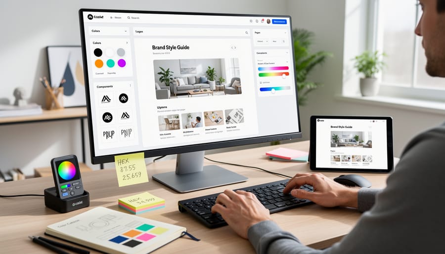
Before you start customizing, gather everything you’ll need for a smooth process. Having these materials ready prevents interruptions and helps you make consistent decisions across your site.
Technical Requirements
You’ll need administrative access to your WordPress dashboard, typically a username and password with full editing permissions. If you didn’t set up the site yourself, contact whoever manages your hosting account to confirm you have admin-level access. Your theme documentation is equally important; most premium themes include setup guides and customization instructions that outline what’s adjustable through built-in options versus what requires custom code.
If your current hosting feels sluggish or unreliable, now is the time to choose reliable hosting before making design changes. A stable server ensures your customizations save properly and display consistently.
Brand Assets to Organize
- Logo files in multiple formats (PNG with transparent background, SVG for scalability, JPG as backup)
- Brand color codes in hexadecimal format (#000000 style) for primary, secondary, and accent colors
- Typography specifications including font names and where to source them (Google Fonts, Adobe Fonts, or custom uploads)
- High-resolution images that represent your brand aesthetic, properly sized for web use
- Any existing brand guidelines or style documents that define visual standards
Create a simple folder on your computer labeled “Website Brand Assets” and drop everything there. When you’re applying your brand colors in Step 2 or uploading your logo in Step 3, you won’t waste time hunting through old files or trying to remember which blue you chose.
The child theme deserves special mention. You’ll either create one or verify that your theme already includes child theme functionality. We’ll cover the setup process in detail during Step 1, but know that you’ll need FTP access or a file manager through your hosting control panel if you’re building it manually. Some themes offer one-click child theme creation, which simplifies this considerably.
Important Safeguards: What to Check First
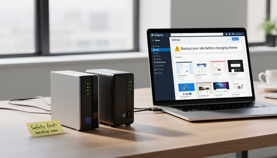
Before you change a single color or upload your logo, take three essential precautions to protect your live site. These safeguards aren’t optional busy-work, they’re what separate a smooth customization process from a recovery nightmare.
First, create a complete backup of your site. This means both your database and all your files. If something goes wrong, a backup is your undo button. Use your hosting provider’s backup tool, a plugin like UpdraftPlus or BackupBuddy, or download files manually via FTP. Store the backup somewhere other than your web server.
A child theme is your insurance policy against lost work. When your theme developer releases an update, it overwrites the theme files. Without a child theme, every customization you’ve made vanishes. Your colors, your custom CSS, your layout tweaks, gone. You’ll either lose your modifications or have to skip security updates, neither of which is acceptable. Setting up a child theme takes ten minutes and will prevent update breaks from derailing your brand alignment work.
If possible, work on a staging site rather than your live site. A staging environment is a private copy of your website where you can experiment without affecting visitors. Many hosts offer one-click staging, or you can use a plugin like WP Staging. Test your customizations there first, then push them live once you’re confident they work.
Finally, avoid making changes during peak traffic hours or right before major events. If something breaks at 2 AM on a Tuesday, it’s inconvenient. If it breaks minutes before a product launch or during your busiest sales period, it’s costly.
Step-by-Step: Customizing Your Theme to Reflect Your Brand
Step 1: Set Up Your Child Theme
A child theme acts as a protective layer over your main (parent) theme, letting you make customizations that won’t vanish when you update the theme. Think of it as working on a transparent overlay rather than marking up the original document.
Why does this matter? WordPress themes receive regular updates for security and features. Without a child theme, those updates overwrite your customizations completely, forcing you to redo all your work. A child theme preserves everything.
Setting Up Your Child Theme
Most modern premium themes include a child theme in the download package. Check your theme files first. If you find one, simply install and activate it through Appearance > Themes before making any customizations.
If your theme doesn’t include a child theme, the easiest approach is using a plugin. Install “Child Theme Configurator” from the WordPress plugin directory. Once activated, go to Tools > Child Theme Configurator, select your parent theme, and click “Create New Child Theme.” The plugin handles the technical setup automatically.
For manual setup, you’ll need to create a new folder in your themes directory with two files: style.css (containing theme header information) and functions.php (linking to the parent theme). This requires FTP access and basic file editing.
Once your child theme is active, all your upcoming customizations live safely in this protected space, independent of parent theme updates.
Step 2: Apply Your Brand Colors Throughout the Site

Color is one of the most immediate brand signals your website sends. Once your child theme is active, updating your color scheme is straightforward and doesn’t require coding for most changes.
Start in your WordPress dashboard under Appearance > Customize. Most themes include a Colors or Color Scheme section here. You’ll typically find options for background colors, text colors, and accent colors. Enter your brand’s hex codes (those six-character codes like #3498db) into the appropriate fields. If you’re unsure which field controls what, change one color to something obvious like bright pink, preview it, then adjust accordingly.
Your theme’s dedicated options panel may offer more granular control. Look for settings panels from your theme developer under Appearance or a custom menu item. These often let you set primary colors for headings, secondary colors for backgrounds, accent colors for links and buttons, navigation bar colors, and footer colors separately.
Pay special attention to contrast ratios between text and backgrounds. Light gray text on white backgrounds might match your brand aesthetic but becomes unreadable, especially on mobile devices. Aim for high contrast on body text and navigation elements.
If your theme doesn’t offer specific controls for an element you want to change, note it down. You’ll address those cases in Step 6 using custom CSS. For now, apply the colors your theme makes easily accessible through its built-in options.
Step 3: Upload and Position Your Logo
Navigate to Appearance > Customize > Site Identity in your WordPress dashboard. You’ll see a “Select Logo” button that opens your media library. Choose your logo file or upload a new one, PNG files with transparent backgrounds work best for flexibility, while SVG files scale perfectly at any size without pixelation.
After uploading, WordPress displays a cropping tool. Most themes let you skip cropping if your logo’s already sized correctly. Aim for 200-400 pixels wide for standard logos; retina displays benefit from twice that resolution. If your file’s too large or needs refinement, optimize logo images before uploading to prevent slow load times.
Once inserted, check the preview panel. Your logo should appear crisp in the header without overwhelming other elements. Many themes offer logo width controls in the customizer, adjust this slider until the proportions feel right. Switch the preview between desktop, tablet, and mobile views to confirm your logo remains readable at smaller sizes. Some themes automatically scale logos for mobile; others require you to set a separate mobile logo size.
Step 4: Customize Typography to Match Your Brand Voice
Typography shapes how visitors experience your brand’s personality before they read a single word. A playful children’s brand needs different fonts than a corporate law firm, and your theme can accommodate both without a rebuild.
Start in your theme’s Typography or Fonts settings, usually found in the Customizer under Site Identity or Typography. Most modern themes offer font pairing systems that let you choose separate typefaces for headings and body text. Select a heading font that captures your brand’s character, bold and geometric for modern brands, serif and elegant for traditional ones, rounded and friendly for approachable businesses.
For body text, prioritize readability over personality. Stick with clean, simple fonts sized at least 16px. Your visitors will spend most of their time reading body copy, so choose something comfortable for extended reading.
If your theme integrates Google Fonts, you’ll have hundreds of options at no cost. Browse fonts that match your brand guidelines, then preview them directly in your Customizer. See how “Montserrat” headlines pair with “Open Sans” body text, or try “Playfair Display” with “Lato” for a more refined look.
Many themes also let you upload custom fonts if you’ve purchased specific typefaces for your brand. Upload the font files through your theme options, then assign them to headings, body, or navigation elements.
Don’t forget your navigation menu. Keep it legible and sized appropriately, typically slightly larger than body text but smaller than headings. Test everything on mobile devices where typography hierarchy becomes even more critical.
Step 5: Adjust Layouts and Spacing for Brand Consistency
Layout and spacing decisions speak volumes about your brand before visitors read a single word. A luxury brand benefits from generous white space that communicates exclusivity and breathing room, while a news-focused site might embrace a compact, information-dense layout that signals efficiency and comprehensive coverage.
Start in your theme’s layout settings, typically found under Appearance > Customize or in a dedicated Theme Options panel. Most modern themes let you control header layouts (centered logo versus left-aligned with menu alongside), sidebar positions (left, right, or no sidebar), and footer configurations without touching code.
Adjust your content width and padding to match your brand’s personality. Wider content areas with minimal sidebars create a contemporary, focused feel that works well for creative portfolios or service-based businesses. Traditional magazine-style layouts with prominent sidebars suit content-heavy sites where readers expect multiple navigation paths.
Pay attention to spacing between elements. Increase padding around buttons, headings, and content blocks if your brand leans premium or minimalist. Tighten spacing for brands that prioritize information density. Preview changes on mobile devices, your layout choices affect mobile reading experiences differently than desktop, and mobile visitors now represent the majority of traffic for most sites.
Step 6: Add Custom CSS for Refined Brand Details
When theme options don’t quite capture the specific look you’re after, custom CSS gives you the precision control to nail those final brand details. You don’t need to be a developer, just a willingness to copy, paste, and adjust a few values.
Navigate to Appearance > Customize > Additional CSS in your WordPress dashboard. This panel lets you add custom style rules that won’t be overwritten when your child theme updates. The changes apply instantly in the preview window, so you can see exactly what you’re adjusting.
Start with button refinements. If your brand uses rounded corners, try adding `.button { border-radius: 8px; }` and adjust the pixel value until it feels right. For hover effects that reinforce your brand personality, something like `.button:hover { background-color: #your-brand-color; transform: translateY(-2px); }` creates a subtle lift that adds polish.
Adjust spacing around specific elements by targeting their class names: `.site-header { padding-top: 30px; }` or `.entry-content { line-height: 1.75; }`. Add borders where your brand calls for definition: `.sidebar { border-left: 2px solid #e0e0e0; }`.
Each small tweak compounds into a cohesive brand presence that feels intentionally yours, not template-default.
Testing Your Customizations and Next Steps

After implementing your brand customizations, you need to verify everything works as intended. Proper testing catches issues before your visitors do and ensures your brand presents consistently across every touchpoint.
Start by systematically checking your customizations across different scenarios:
- Test on multiple devices, view your site on a desktop, tablet, and smartphone to confirm your logo scales properly, colors display correctly, and layouts adjust responsively without breaking.
- Check different browsers, open your site in Chrome, Firefox, Safari, and Edge to catch any rendering inconsistencies, particularly with custom fonts and CSS modifications.
- Review various page types, navigate through your homepage, blog posts, archive pages, and any custom landing pages to ensure brand elements appear uniformly throughout.
- Verify interactive elements, click all buttons, test navigation menus, and check hover effects to confirm your custom styling works across all states.
- Test site speed, use tools like Google PageSpeed Insights to ensure your customizations haven’t significantly slowed loading times, as performance affects user experience and search rankings.
- Run a security check, check SSL before launch and confirm your site displays the padlock icon, particularly if you’ve modified header code.
Ask a colleague or friend unfamiliar with your changes to navigate your site and share honest feedback. Fresh eyes often spot inconsistencies you’ve overlooked.
Success means your brand identity is recognizable and consistent, navigation remains intuitive, all functions work smoothly, and the site feels polished rather than patched together. Minor tweaks are normal, brand alignment is iterative, not instant.
If testing reveals problems beyond your comfort zone to fix, or if achieving your vision requires extensive custom code, that’s when professional WordPress development help makes sense. Most brand customizations, though, need only the adjustments you’ve made and patience during testing.
Common Questions About Theme Customization
Can I customize any WordPress theme?
Most modern WordPress themes support some level of customization through the Customizer, but the extent varies significantly. Themes built with flexibility in mind offer more options through native settings, while restrictive themes may require more custom CSS or code modifications to achieve brand alignment.
Will my changes disappear when the theme updates?
Changes made through the WordPress Customizer or theme options panel are stored in your database and survive updates. However, direct edits to theme files will be overwritten unless you’re using a child theme, which is why setting one up is essential before making any code-level modifications.
Do I need coding knowledge to customize my theme?
Basic customizations like colors, logos, and fonts typically require no coding through built-in theme options. More refined adjustments using custom CSS require minimal coding knowledge, as you can often adapt simple examples to your needs, but complex structural changes may benefit from professional assistance.
How much customization is too much?
If you’re fighting against your theme’s core design rather than refining it, you’ve likely exceeded practical customization limits. Extensive custom CSS to override fundamental layouts, persistent conflicts, or spending more time fixing issues than building content are signs you’d be better served by a different theme.
Beyond these common concerns, many people wonder when they should abandon customization efforts and choose a new theme instead. If your current theme lacks essential features your brand needs, requires constant workarounds, or feels structurally misaligned with your content type, switching themes is often more efficient than forcing compatibility. Looking at custom theme examples can help you identify whether your goals fit within customization boundaries or require a purpose-built solution.
The fear of making mistakes shouldn’t paralyze your customization efforts. With proper backups and a child theme in place, you can experiment safely. Most changes through the Customizer include live preview, letting you see modifications before publishing them. If something goes wrong, you can restore your backup, deactivate the child theme, or use the browser’s undo function in the Additional CSS editor. The worst-case scenario with proper safeguards is simply reverting to your previous state and trying a different approach.
You now have a clear path to bring your brand to life on your website without the upheaval of starting over. The process we’ve covered isn’t about complex technical skills or expensive overhauls. It’s about strategic, focused changes that honor your brand identity while respecting the foundation you’ve already built.
The customizations you make today aren’t final. Your brand will evolve, and your website should evolve with it. The beauty of this approach is that you can refine colors, adjust typography, or refresh your logo whenever your brand takes its next step forward. You’re not locked into today’s choices.
Nine Spheres themes are built with exactly this flexibility in mind. Every theme in our collection provides robust customization options that let you express your unique brand personality without fighting against the design. We believe your website should adapt to your vision, not the other way around.
Take the first step today. Set up that child theme, gather your brand colors, and start with one small change. You’ll be surprised how quickly your website begins to feel authentically yours. Your brand deserves to shine through every page, and now you know how to make that happen.